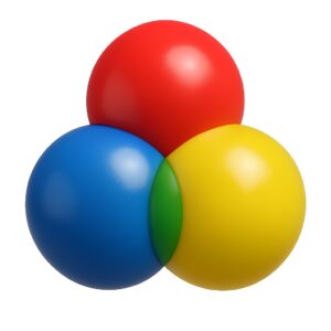
Create Perfect Colors
Mix, match, and discover beautiful color combinations with our advanced color mixing tool. Perfect for designers, artists, and developers.
Start MixingColor Mixing Tool
Mix Colors by Percentage
RGB Color Sliders
The Art and Science of Color Mixing
The Importance and Use of Color Mixing in Design
Understanding Color Theory
Color mixing is a fundamental aspect of design that impacts how we perceive and interact with visual content. Whether you’re a graphic designer, web developer, or artist, understanding how colors work together is crucial for creating visually appealing and effective designs.
The Psychology of Color Combinations
Color evoke emotions and convey messages without words. The right color combination can create harmony, draw attention, or establish brand identity. For example, blue often represents trust and stability, while red can signify passion or urgency. By mixing color strategically, designers can guide user experience and reinforce brand messaging.
Practical Applications of Color Mixing
In web design, color mixing helps create accessible interfaces with sufficient contrast for readability. In branding, it ensures consistency across various media. For digital artists, understanding color mixing enables the creation of realistic shadows, highlights, and textures.
Color Models and Digital Implementation
Digital platforms primarily use the RGB (Red, Green, Blue) color model, where colors are created by combining light of different wavelengths. Understanding how to mix these primary colors allows designers to create millions of color variations for digital projects.
Tools for Effective Color Mixing
Modern design tools and color pickers have made color mixing more accessible than ever. Online tools like our Color Mixer help designers experiment with combinations and find the perfect shades for their projects without guesswork.
Color Accessibility Considerations
When mixing colors for digital interfaces, it’s essential to consider accessibility. Sufficient color contrast ensures that text remains readable for users with visual impairments. Tools like our color mixer help designers check and adjust contrast ratios to meet accessibility standards.
Future Trends in Color Usage
As design trends evolve, so do color preferences. Currently, we’re seeing a shift toward bold, saturated color and gradients. Understanding color mixing principles allows designers to stay ahead of trends while creating timeless color palettes.
Conclusion
Mastering color mixing is an essential skill for any visual creator. It bridges the gap between artistic expression and technical implementation, resulting in designs that are both beautiful and functional. With the right tools and knowledge, anyone can harness the power of color to create compelling visual experiences.
Frequently Asked Questions
1. What is color theory?
Color theory is a set of principles used to create harmonious color combinations. It involves the study of how colors interact, how they can be mixed, and the visual effects of specific color combinations.
2. What are primary color?
Primary colors are the set of colors that can be combined to make a useful range of colors. In the RGB color model, the primary colors are red, green, and blue. In traditional color theory, they are red, yellow, and blue.
3. How does color mixing work?
Color mixing depends on the color model. In additive color mixing (like light), combining all primary color produces white. In subtractive color mixing (like paint), combining all primary colors produces black or a dark brown.
4. What is the difference between RGB and HEX color codes?
RGB values represent colors using three numbers (0-255) for red, green, and blue components. HEX codes are hexadecimal representations of the same RGB values, using six characters (from 0-9 and A-F) preceded by a hash (#).
5. How can I create accessible color combinations?
To create accessible color combinations, ensure sufficient contrast between foreground and background colors. The Web Content Accessibility Guidelines (WCAG) recommend a contrast ratio of at least 4.5:1 for normal text.
6. What are complementary colors?
Complementary colors are pairs of colors that are opposite each other on the color wheel. When placed next to each other, they create the strongest contrast and reinforce each other’s intensity.
7. How do I choose a color palette for my website?
Start with a base color that represents your brand. Then use color theory principles to select complementary, analogous, or triadic color. Limit your palette to 3-5 main colors for consistency.
8. What is color psychology?
Color psychology studies how color affects human behavior and emotions. For example, blue often evokes trust and calmness, while red can stimulate excitement or urgency.
9. How can I convert between different color models?
Our tool automatically converts between RGB and HEX. For other conversions (like CMYK or HSL), you would need specialized formulas or tools designed for those specific color models.
10. What are warm and cool colors?
Warm colors (reds, oranges, yellows) are associated with warmth, energy, and excitement. Cool colors (blues, greens, purples) are associated with calmness, peace, and professionalism.