How to fix mistakes of selecting brand colors
A Beginner’s Guide to Picking Colors for UX and UI
Picking shades for a brand seems straightforward at first glance. Yet liking certain hues does not mean they fit together well. Slapping them onto a logo then walking away – that rarely works out. Websites built this way often feel off without clear reason.
Most companies mess up right at this point.
Color in UX and UI does more than fill space. It speaks before words, shapes how people feel, guides their eyes. A bad choice doesn’t only look wrong – it confuses, pushes users away, breaks flow. Trust fades fast when contrast fails or meaning gets lost. Even small shifts can alter behavior without anyone noticing why.
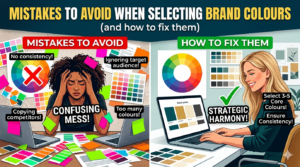
This simple guide shows common errors in picking brand colors – along with fixes. Mistakes often start with ignoring audience perception, so checking emotional responses helps realign choices. A frequent slip is choosing shades that lack contrast; fixing this means testing visibility across devices. Sometimes brands copy trends too closely, ending up indistinct – shifting toward original palettes builds recognition. Colors might look great alone but clash together; previewing combinations prevents visual noise. Ignoring accessibility creates barriers, making adjustments for color blindness essential. Each misstep links to user experience, where small tweaks improve clarity. Learning these patterns makes future decisions smarter. Understanding the reasons behind poor picks supports better outcomes.
Begin at the beginning, then move forward slowly. Confidence grows when each part makes sense.
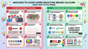
1. Treating Brand Color Selection Like Personal Taste
Choosing a color because you like it isn’t planning
Colors often picked just because someone likes them can miss the mark. Though feelings about hues run deep, they seldom match what users actually require.
Colors matter in user experience
- Support readability
- Guide attention
- Communicate brand intent
- Work across devices and contexts
However, beginners often ask, “What colors do I like?” instead of “What colors will my users understand?”
Fixing This Common Error
Turn the view around, try standing where they stand. Shift the angle on that issue, let their needs sit first while yours waits.. Watch how that changes everything slowly.
Start by asking:
- Who is my target audience?
- What emotions should the brand evoke?
- On what screens might someone see these shades appear?
For example:
- Some fintech companies pick blue tones because they feel steady. Trust shows up in color choices, quietly shaping how people react. These shades suggest reliability without needing words. Blue appears again and again where confidence matters most
- Wellness brands lean toward greens and neutrals
- Colors that pop often catch younger eyes. Energetic shades show up a lot in stuff made for teens. Bright tones tend to stick around when the target crowd skews young.
What works beats what looks good in design. A thing must do its job before it pleases the eye. Usability leads; taste follows behind. Shape matters less than use. Design serves action first, opinion second. Practicality sets the pace. Looks tag along later.
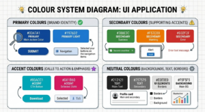
2. Too Many Colors With No Plan
Visual Clutter Distracts Users
Too many colors cause problems. New designers pick lots of hues, hoping for a creative look. Excitement leads to clutter instead
Unfortunately, too many colors:
- Confuse users
- Reduce visual hierarchy
- Weaken brand recognition
- Increase cognitive load
Looking at how it appears on screen, things get tougher to follow quickly. A person might struggle to grasp what’s where without extra effort.
Fixing This Common Error
A smart move would be building colors into a clear framework instead of scattering them without order.
A first look at colors might show something like this:
- 1–2 primary colors (brand identity)
- 2–3 secondary colors (supporting elements)
- 1 accent color (CTAs and highlights)
- Neutral colors (backgrounds, text, borders)
Usage rules need spelling out too. Take this case: one rule might limit access during busy hours
- Primary color = buttons and headers
- Accent color = call-to-action only
Putting things this way helps your interface feel quieter, easier to follow, yet still sharp.
3. Overlooking Accessibility and Contrast

Poor Contrast Disrupts User Experience
Screen hues often deceive those just starting out. Yet behind bright displays lies a problem – real conditions expose poor choices. Contrast gets overlooked. Accessibility fades into the background. What looks sharp at home turns unclear elsewhere. Light tricks the eye until context changes everything.
Low contrast:
- Makes text hard to read
- Frustrates users
- People who have trouble seeing are left out
What you’re looking at isn’t merely poor layout. It misses how people actually interact. A stumble in function, not just form.
Fixing This Mistake
Right off the bat, know this – accessibility isn’t something you can skip. Built into every solid UX foundation, it stands firm.
Here’s how to fix contrast issues:
- Use contrast-checking tools (WCAG guidelines)
- Avoid light text on light backgrounds
- Avoid dark text on dark backgrounds
Most times you can count on this
- Body text should always have high contrast
- Buttons should clearly stand out from backgrounds
Start by thinking about access, then watch how it lifts every person. A single choice here can open doors far beyond the intended few.
4. Ignoring Color Psychology and Brand Significance
Colors Communicate Without Words

Red stirs urgency, while blue whispers calm – first feelings happen fast. Skipping the mind behind shades might leave visitors confused instead.
For example:
- Fire engines wear red because it shouts fast. Danger hides in that color too. Faster than thought, energy runs deep inside. A rhythm pushes forward, steady as breath.. Red does not whisper
- Calmness often comes through in shades of blue. Trust shows up here, too. Reliability tags along, quietly. Peace lives inside this color just as much
- Yellow can feel optimistic – or overwhelming
Should these meanings clash with your brand, confusion takes hold instead of clear understanding.
Fixing This Mistake
To fix this, connect color choices directly to brand values.
Ask yourself:
- Surprise might hit them first. Then maybe curiosity. A glance could spark recognition. Familiarity may grow slowly. Trust might appear over time. Emotions can shift without warning. First impressions often change later.
- What kind of mood should the design have – quiet, strong, lighthearted, or strict?
Start by checking how colors look on actual devices using real content. When designing interfaces, what happens in practice beats any textbook rule.
5. Choosing Colors Before Seeing the Interface
Colour Swatches Don’t Show Full Design Context
Picking shades without context causes problems down the line. Some people rely on color tools yet skip checking how those tones look when placed within actual screens.
As a result:
- Buttons don’t stand out
- Text loses readability
- Interfaces feel unbalanced
From a UI perspective, colors must work inside layouts, not just in palettes.
Fixing This Mistake
Try out shades inside actual interface pieces. Look at buttons, see how they appear. Check menus, notice the look there. Watch headers, pay attention to those details. View forms, study their color behavior. Test sliders, examine the results closely
- Buttons
- Forms
- Navigation menus
- Cards and sections
Start by picking a tool such as Figma or Canva to build mockups with your chosen colors. Seeing color alongside layout gives clarity on how it affects space, type choices, balance – everything really. With these visuals, decisions come easier because everything shows up exactly where it should.
Truth lives in testing, not guesses, when it comes to UX design. Every single moment.
6. Ignoring consistency across platforms
Inconsistent Colours Undermine Brand Trust
One shade might show up on Instagram, another on a website. Without clear rules, colors drift apart by accident.
When things keep changing without reason, people notice right away. It makes them wonder if they can count on the product at all. Confusion creeps in when screens behave differently each time. Trust fades fast under those conditions. Smooth experiences come from steady patterns, not surprises.
Fixing This Mistake
Create a simple color style guide that includes:
- Web color HEX codes
- RGB values for screens
- CMYK values for print
Start by calling each color something obvious instead
- Primary Blue
- Secondary Grey
- Accent Orange
This keeps things matching throughout
- Websites
- Apps
- Social media
- Marketing materials
Sticking to the same patterns builds trust fast. What feels familiar usually works better. When things stay predictable, people move easier. Same choices, repeated actions – they just flow. A steady rhythm makes everything feel lighter. Over time, it adds up without effort.
7. Ignoring Dark Mode and Long Term Growth
Modern UI Needs Adaptable Colors
Most new designers skip ahead without thinking about dark mode. Yet layouts today need to shift smoothly across devices. Themes that help people see better? They get left out too often. Accessibility slips through the cracks – especially when learning. Responsive structure, night settings, clear contrast: these show up late, if at all.
Later on, mismatched hues could force a complete overhaul. When shades fail to grow together, fixes might become unavoidable. A system that cannot stretch with color may demand full reworking down the line.
Fixing This Mistake
Build palettes using families of tones instead. One shade alone rarely works well across materials and screens.
For example:
- Light background version
- Dark background version
- Hover and active states
Looking forward helps protect your brand while cutting down on tech issues later. What comes next matters less when today is built smarter. A clear path now means fewer fixes tomorrow. Planning early shapes smoother outcomes without extra weight piling up.
8. Color shapes how users experience interfaces
Choosing colors that mean something for your brand
Picking the wrong brand colors can trip you up fast – knowing what not to do puts you ahead before you even start.
To recap:
- Design for users, not preferences
- Use structured color systems
- Prioritize accessibility
- Test colours in real UI
- Stay consistent across platforms
Color picks in UX and UI quietly steer feelings, movement through screens, belief in what you see. Done well, these shades act like unseen helpers – making things smoother while staying out of view.
Good design works quietly, doing just what it needs.
Frequently Asked Questions
1. Why shouldn’t I choose brand colors based on personal preference?
Most people pick shades they enjoy – yet that choice might ignore who actually uses the product. Colors tied to a name need to make text clear, steer the eye, express purpose, function on varied displays. Rather than wondering about personal taste, shift toward how others interpret tones. Think about whom you aim to reach, feelings you want stirred, places those hues show up. A screen in sunlight reads differently than one indoors. Preferences fade when usability takes over.
2. Most brands work best with three hues. One shade leads the way. Another pairs alongside it. A third fills gaps when needed. Some add a fourth if tasks demand more variety. Too many make choices harder. Fewer than three might limit flexibility. Balance matters most in the end.
Pick a main color or two to stand for your brand. Alongside those, choose three more – not too many – for less important parts like sidebars or icons. Add one standout shade just for things you want noticed, like links that lead somewhere. Neutrals handle the rest – walls of text, page bases, lines between sections. When there are too many hues fighting for attention, people get lost trying to figure out what matters. Order helps. Set limits on where each shows up: bold tones go here, bright ones only there. A button wears the core tint. The pop of contrast lifts key moments without shouting. Rules keep it calm, clean, under control.
3. What are the consequences of poor color contrast in brand design?
Reading becomes tough when colors blend together too much. Faded text annoys many, especially those who struggle to see well. Poor contrast goes beyond looks – it breaks how things work online. Try checking shades with tools built for accessibility rules. Light words on pale surfaces cause trouble, just like black text on near–black does. Body paragraphs need strong color separation to be clear. Buttons must pop against their backdrop without confusion.
4. How does color psychology affect brand perception?
Red shouts fast, risky, alive. Blue breathes slow, steady, safe. Yellow dances bright but sometimes too loud. Mismatched colors muddy the message people take in. Feelings come first when picking hues – what do you want them to sense? Quiet strength might need gray. Bold joy could lean on orange. Every shade answers a question about who you are. The right tint fits like a note in a song that already exists.
5. Why should I test colors within actual interface designs rather than just using color swatches?
Most times, choosing colors alone leads to trouble since tiny samples miss the big picture. Without seeing them in working designs, some elements hide when they should pop, words get hard to read, others clash oddly. Try hues directly in live parts – navigation bars, input fields, alerts, footers – with apps such as Sketch or Adobe XD for previews. Real answers come from trying, never assuming.
6. How do I ensure brand color consistency across different platforms?
A solid set of named shades – think “Primary Blue,” “Secondary Grey,” or “Accent Orange” – forms the base. Each one carries HEX for digital pages, RGB for displays, plus CMYK when printed on paper. Matching tones appear across websites, mobile tools, online posts, alongside brochures and ads. When hues shift between places, people notice – and it breaks confidence slowly. Uniformity, though quiet, strengthens familiarity with every view.