How to choose accent colors for UI design

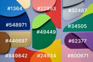
How to choose accent colors for UI design A UX and UI Guide for Beginners on Building Visual Focus Without Clutter Red might catch your eye first. Yet some shades matter more than others. On screens small or large, certain tones pull focus on purpose. Used well, those hues point the way without words. Misplaced, they mislead instead. Wrong choices break flow fast. This beginner-friendly guide explains how to choose accent colors for UI design Start by understanding complementary colours – those opposites on the wheel that spark visual tension. Picture one hue setting another alive, not just sitting beside it. Accent shades? They’re not extras; they guide where eyes go first. Newcomers often clash tones without planning, tossing bold pairs together like dice. Stillness shows up where one hue steps back so another can speak. Harmony lives in gaps, in pauses, how pieces wait their turn. Begin at the beginning, then shape a strong base for UI colours. A clear core comes first – build from there. Understanding Complementary Accent Colors Complementary Colours in UI Design? Across the colour circle, some shades face one another directly. These are known as paired opposites. Think red beside green, blue against orange, yellow across from purple Blue and orange Red and green Purple and yellow White against black grabs eyes fast in interface layouts. A sharp difference pulls focus without effort. Dark tones beside light ones stand out clear. Bright elements on dark backgrounds catch sight quick. …