Test color palette on mobile desktop accessibility
Introduction
One moment – imagine picking colors carefully on a big screen, then opening your work elsewhere and seeing something off. It happens more than anyone admits. Picture that shift when a shade appears dull on a handheld device compared to a wide monitor. Testing those tones everywhere isn’t extra anymore. Think about scrolling through sites on a train, then continuing at home on a larger display – the hues should feel familiar. A slight mismatch might seem minor until reading becomes hard. Trust slips too, without noticing why. Vision differences add another layer; what shows clearly for one person may vanish for another. Screens differ in brightness, contrast, even tint. So checking across phones, laptops, tablets matters just as much as choosing the right hue to begin with.
On desktop, a shade can seem sharp – yet feel flat when seen on phones. Picture your colors as shape-shifters; they shift with screens around them. Step by step, explore real ways to check tones on different gadgets without breaking access rules. Finish knowing how balance stays strong – and who sees it clearly.
Why Color Testing Matters
How Mixed Colors Affect User Experience
Red on one screen might look pink on another. If a button shifts shade between phones and laptops people pause. That moment of doubt? It breaks flow. Missed actions follow. Consistency keeps steps smooth.
How something works defines its design every bit as much as how it appears. – Steve Jobs. Wrong shades mess up everything else instead.When hues wobble, details blur. Everything shifts slightly wrong. Tone stumbles first. Rhythm follows close behind. A single misstep spreads fast.
How People See Brands and What They Believe
Blue might mean trust to you. Yet if your logo uses one blue while buttons use another, visitors notice. A mismatch like that chips away at how serious they take your work. Trying different versions first keeps things looking sharp.
Testing color palettes on mobile desktop and accessibility
What happens around a device matters as much as the gadget itself.
Devices vs Environments
- Screen size
- Resolution
- Display technology
- Ambient lighting
Real People in Real Situations Compared to Lab Tests
Testing on actual devices works better than simulations, especially when paired with checks for accessibility compliance.
Checking Color Schemes on Phones
Little displays glow sharp, differ wide. Success at a desk can flop in hand.
Screen Sizes and Resolutions
Start tasting here
- Small phones
- Large phones
- Tablets
Start by looking at how easy the text is to read. Then move on to whether colors stand out clearly against each other. See if buttons or links are easy to press without error.
Amoled And Lcd Compared
Darkness sinks deeper on AMOLED screens, while LCDs often appear faded. Richer tones emerge here – yet spill slightly when uncontrolled. Try each type before deciding, since vividness can go too far.
Light Mode Versus Dark Mode Testing
Always test:
- Light mode
- Dark mode
- Auto system switching
White text on black might shift attention where it shouldn’t go. How a design guides eyes changes when background and foreground swap roles without foresight.
Testing Color Palettes on Desktop Screens
Most people at desks pick big screens they’ve adjusted for accuracy – though that isn’t universal. Some skip calibration entirely, relying on default settings instead.
Monitor Calibration Basics
Most people never set up their monitor properly. So your designs need to look right on those uneven displays.
Operating System Color Profiles
Test on:
- Windows
- macOS
- Linux
Each OS handles color profiles slightly differently.
Cross Browser Color Consistency Checks
Some browsers show shades through unique systems. Others rely on separate methods entirely.
Browser Differences Chrome Firefox Safari Edge
Check gradients, shadows, and subtle tones across browsers.
CSS color variations across browsers
Even tiny shifts in RGB, HEX, or HSL might alter how a color looks. Use fixed reference points instead of guessing. When in doubt, go by exact numbers already tested.
Check Colors for Accessibility
Good design means everyone can use it.
WCAG Contrast Guidelines
WCAG recommends:
- Minimum contrast ratio of 4.5:1 for text
- 3:1 for large text
AA Versus AAA Guidelines
- Most sites work fine with AA. Still, some need more than that to meet guidelines properly
- AAA: Best for critical readability
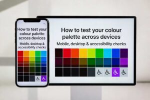
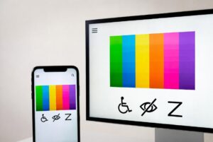
Color Blindness Considerations
Most men – about eight out of every hundred – experience some form of color vision issue; far fewer women do, just half a percent. Because of this difference, depending only on color can leave people confused.
Check Colors on Different Screens
Browser Developer Tools
Use built-in tools to simulate the following:
- Screen sizes
- Colour vision deficiencies
- Contrast ratios
Online Accessibility Checkers
Popular tools include:
- Contrast checkers
- Colour blindness simulators
- WCAG audit tools
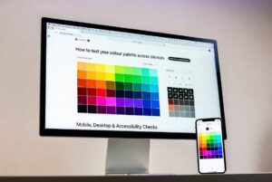
These make testing your color palette across devices: mobile, desktop & accessibility checks much easier.
Real-World Testing Methods
User Testing Feedback
Ask real users:
- Is text readable?
- Are buttons visible?
- Does anything feel “off”?
Device labs and emulators
When juggling gadgets isn’t possible, try emulators instead. They step in nicely when real hardware’s out of reach.
Common Errors in Testing Color Palettes
Relying on Just One Device
Stories unfold across screens. Each display shares just a single tale. People experience several at once.
Ignoring Accessibility Warnings
Red flags show up when accessibility fails – it is never just a tip. Warnings mean something blocks access; that matters.
Reliable Color Testing Made Simple
building a testing checklist
Include:
- Mobile testing
- Desktop testing
- Browser testing
- Accessibility checks
Iterative Improvement Approach
Start testing, adjust a little, then check again. Good color sets grow over time.
Color testing evolving over time
AI-Driven Accessibility Testing
Faster than hand reviews, AI spots contrast problems without delay. What slips past people gets caught by machines right away. Seeing gaps in access becomes simpler when software does the scan first.
Adaptive Color Systems
Tomorrow belongs to setups shifting hues with gadgets, surroundings, then personal tastes.
FAQs
Why does my color palette look different on mobile and desktop?Colors shift depending on the screen type, how bright it is, also what resolution it uses. Some displays stretch hues oddly when light levels jump. Pixel density sometimes twists tones in ways you do not expect. Brightness spikes can mute certain shades while boosting others by accident.
What contrast ratio is best for accessibility?
Text should have at least a 4.5 to 1 contrast ratio, according to WCAG rules.
Can browser tools replace real-device testing?
Real tools beat helpers every time when precision matters. Accuracy leans toward actual hardware, not assistance.
Dark mode checks – worth doing?
Maybe so True. A lot of people choose dark mode because colors show up in a new way there.
How often should I test my color palette?
Whenever you update your design, branding, or user interface.
Conclusion
One way to check your color choices is seeing how they appear on phones, computers, or assistive tools – this helps people actually use what you make. Seeing things through different eyes matters more than making it look nice; clarity builds confidence, opens access. Shift between screens, shift between settings, include real-world conditions so results stay reliable over time. Keep adjusting, keep observing, notice small shifts that affect understanding. Each display shows something slightly new.