
How to Build an Accessible Colour Palette with Proper Contrast & Hex Codes
Introduction
In today’s digital-first world, accessibility in design isn’t just a trend — it’s a responsibility. A well-crafted colour palette ensures your brand or website is visually appealing and inclusive for everyone. Understanding how to build an accessible colour palette with proper contrast & hex codes is key to creating designs that meet accessibility standards while maintaining creativity and style.
Accessible colour choices help users with visual impairments, colour blindness, or low vision comfortably interact with your website or app. This guide will walk you through the principles, tools, and practical steps to design a colour system that balances beauty, usability, and inclusivity.
Why Accessibility in Colour Design Matters
Visual Inclusivity and Brand Trust
Over 300 million people worldwide experience some form of colour blindness. If your colour palette lacks contrast or accessibility, a significant portion of your audience may find it difficult to navigate your site or read your content.
Accessible colour design is not just about compliance with WCAG (Web Content Accessibility Guidelines) — it’s about empathy, user trust, and clear communication.
As the saying goes:
“Good design is inclusive design — it communicates with everyone.”
Understanding Colour Contrast in Accessibility
What Is Colour Contrast?
Colour contrast refers to the difference in brightness and colour between two elements — usually text and background. The higher the contrast ratio, the easier it is to read and perceive information.
For example, black text on a white background has a high contrast ratio, making it easy to read. In contrast, light grey text on a pastel background offers poor readability, especially for people with vision challenges.
WCAG Contrast Requirements
According to the Web Content Accessibility Guidelines (WCAG 2.1):
- Normal text should have a contrast ratio of at least 4.5:1.
- Large text (18pt and above) should have at least 3:1.
- Essential graphics and UI elements (like buttons or icons) should also maintain a ratio of 3:1 or higher.
You can test contrast using tools such as:
- WebAIM Contrast Checker
- Contrast Ratio by Lea Verou
- Accessible Colors Tool
How to Build an Accessible Colour Palette with Proper Contrast & Hex Codes
- Start with a Neutral Base Colour
Every accessible palette begins with a base. Neutrals like white (#FFFFFF), off-white (#F8F8F8), or dark grey (#1E1E1E) serve as reliable backgrounds.
Choose one neutral base for light mode and one darker shade for dark mode. This ensures consistency and accessibility across all environments.
- Choose Your Primary Brand Colour
Select one primary colour that represents your brand identity — this could be a bold tone like blue (#007BFF) or green (#28A745).
Pro Tip:
Check the colour’s contrast against both light and dark backgrounds. Use a contrast checker to ensure it maintains readability when used for text, icons, or buttons.
- Add Accent and Supporting Colours
Add 2–3 accent colours to complement your primary tone. These are often used for highlights, icons, or secondary buttons.
Example:
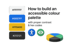
- Primary: Blue (#0057FF)
- Accent: Yellow (#FFB400)
- Secondary: Teal (#00BFA6)
Make sure each combination maintains proper contrast ratios.
- Define Text and Background Colours Clearly
Text should always have strong contrast with its background. Here are some accessible pairings:
- Dark text (#212121) on white background (#FFFFFF)
- White text (#FFFFFF) on navy blue background (#001F3F)
- Black text (#000000) on pale yellow background (#FFF7D1)
- Test Your Palette for Colour Blindness
There are various forms of colour blindness — protanopia (red-green), deuteranopia, and tritanopia (blue-yellow).
Use tools like Coblis (Color Blindness Simulator) to check how your palette appears for different users.
Quick Tip:
Avoid relying solely on colour to convey meaning — use icons, textures, or labels too.
- Document Your Hex Codes and Accessibility Ratios
Once your palette is finalized, create a simple style guide that includes:
- Colour swatches
- Hex codes and RGB values
- Usage examples (background, text, button, etc.)
- Contrast ratios
Example Documentation: How to build an accessible colour palette
| Colour Name | Hex Code | Use Case | Contrast Ratio |
| Primary Blue | #0057FF | Buttons, links | 7.8:1 |
| Secondary Yellow | #FFB400 | Highlights | 4.9:1 |
| Neutral White | #FFFFFF | Background | N/A |
| Text Grey | #212121 | Body text | 15:1 |
Common Mistakes to Avoid in Accessible Colour Design
- Using Light Text on Light Backgrounds
- This reduces readability, especially in daylight or on mobile screens.
- Ignoring Colour Contrast for Hover or Focus States
- Interactive elements must be visually distinct when focused or hovered.
- Overusing Vibrant Colours
- Bright or saturated colours can strain the eyes; balance them with softer tones.
- Relying Only on Colour for Feedback
- Use icons or text to accompany visual states like errors or success messages.
Tools for Building Accessible Colour Palettes
Here are some powerful, free tools you can use:
- 🎨 Coolors.co: Generate and adjust colour palettes with contrast previews.
- ⚙️ Accessible Palette: Automatically recalculates tones for WCAG compliance.
- 🧮 Colorable: Interactive tool for testing contrast between colour pairs.
- 👁️ Stark (Figma Plugin): Simulates colour blindness and checks contrast within your design workflow.
Pro Tips for Designers
- Stick to a maximum of 5–6 colours in your palette for clarity.
- Always test colours on real text and buttons, not just swatches.
- Keep accessibility in mind for both light and dark themes.
- Regularly validate your colours as part of ongoing design updates.
Quote to Remember
“Colour accessibility isn’t a limitation — it’s a design evolution that includes everyone.”
Conclusion
Designing with accessibility in mind doesn’t mean sacrificing creativity — it enhances it. By understanding how to build an accessible colour palette with proper contrast & hex codes, you’re building inclusivity into your brand’s DNA.
An accessible palette ensures that your content is legible, your visuals are inclusive, and your brand resonates with a wider audience. Start experimenting today, test your colours, and make accessibility your brand’s competitive advantage.
Remember: Good colour design doesn’t just look beautiful — it feels welcoming.