Spring Summer Autumn Winter Color Schemes
Introduction
Every season reshapes how we see colour, shaped by feelings, events, lights shifting. Heading into fresh creative phases, knowing what hues define 2025 – spring through winter – matters quietly but deeply for those shaping visuals. Instead of mere decoration, shades now carry meaning: echoes of nature care, digital life, shared values. What we choose reflects more than taste – it maps where society leans.
Each year, colours shift under quiet forces – mood, tech, environment. By 2025, earthy whispers meet pixel-bright hopes in everyday visual choices. Spring arrives with soft blushes, pale yellows, cool mint greens – not just pretty but grounded. These evolve into summer’s bolder expressions: warm corals paired with sun-bleached teals. Autumn leans into deeper ochres, mossy shades, hints of burnt rust – organic depth without heaviness. Winter follows with charcoal greys, near-blacks touched by frosty blue undertones. A sense of stillness guides these selections; clarity matters more than flash. Soft light starts shaping digital areas, easing strain rather than slicing through darkness. Mood guides colour choices now, not what’s new or loud online. Websites adjust saturation carefully, using light as part of palette decisions. Fashion reflects the same restraint – layers in tonal ranges, subtle shifts rather than bold clashes. Even app interfaces prefer muted primaries balanced with breathable space. What stands out is intentionality – the thought behind each hue chosen. Colours serve function now, blending visibility with comfort. This isn’t about rules, but rhythm – how tones move through time and context. One shade may start in clothing, then appear in dashboard icons months later. Influence flows both ways between physical materials and screen-based design. Pigments respond to cultural pace: slower, reflective, less frantic. Expect fewer surprises, more cohesion across uses. Not every season needs reinvention. Sometimes continuity feels like progress.
Seasonal colour trends matter
Understanding the growing significance of seasonal color schemes comes first, before exploring individual seasons. What makes these palettes stand out today isn’t obvious at a glance.
- Consumers emotionally connect with colours
- Seasonal palettes improve visual storytelling
- Brands using timely colours feel modern and relevant
“Color is a power which directly influences the soul.”
Out of nowhere, the move reshapes how we see seasonal hues – spring through winter – not as passing looks but as quiet tools with purpose. Instead of just looking good, they begin pulling weight. Each palette finds its role. Colour stops being decoration when timing gives it direction. What was once fleeting now holds ground. Through subtle change, choices gain momentum behind the scenes.
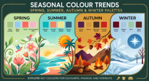
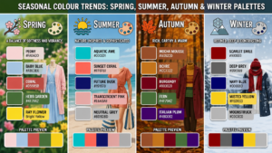
Spring Color Trends
Spring Colour Mood
Renewal takes center stage in Spring , along with a quiet sense of hope. Soft tones replace the sharp contrasts that dominated recent seasons. A shift emerges – not loud, but clear – toward hues that feel restful. Instead of intensity, there’s ease; instead of contrast, balance returns. Calm becomes the message, whispered through lighter palettes. What was once sharp now blurs into something kinder.
Key Spring Colours
- Soft mint green
- Warm peach
- Sky blue
- Lavender mist
- Butter yellow
These Colours Work Because They Balance Each Other
Palettes inspired by spring mix natural tones with screen-ready hues. These shades perform well where organic feel meets modern display needs
- Lifestyle brands
- Wellness websites
- Mobile app UI
- Social media visuals
Spring Palette Applications
- Light backgrounds with pastel accents
- Soft gradients for hero sections
- Minimalist branding refreshes
Summer Color Shifts
Summer Colour Mood
Spring breathes in fresh beginnings, wrapped in a hush of optimism. Out go the bold clashes that ruled before; soft hues slip into view instead. A shift happens without noise – gentle colors settle where stark lines once stood.
Trending Summer Colours
- Coral red
- Ocean teal
- Sunlit gold
- Tropical green
- Electric blue
What’s Different ?
These days, summer palettes skip the bright chaos once common. Instead, softer tones appear – easing strain while supporting wider use. Quiet intensity replaces loud flashes, favouring calm over shock.
Summer palettes work well for light skin tones warm lighting and seasonal color matching
- E-commerce promotions
- Travel and hospitality branding
- Campaign landing pages
Bold summer shades work well when set beside neutral white tones or muted gray hues. Balance emerges through contrast between vibrant tones and quieter ones nearby.
Autumn Colour Trends
Autumn Colour Mood
Warmth matters most in Autumn 2025. Grounded hues take center stage, pulling directly from nature’s palette. Instead of bright contrasts, deeper pigments emerge – truthful, steady choices. Color trends reflect a need for stability, leaning into browns, mossy greens, and soft ochres. These shades appear everywhere, shaping moods without demanding attention.
Top Autumn Colours
- Burnt orange
- Olive green
- Clay brown
- Deep mustard
- Dusty terracotta
Earth Tones Rise in Popularity
From natural materials comes a quiet shift in preferred shades. Trust builds slowly when tones echo earth and sky. Timeless palettes emerge without chasing trends. Roots in ecology shape what feels steady.
Autumn Palette Applications
- Brand storytelling
- Editorial websites
- Product packaging
- Long-form content visuals
Fall color schemes add a quiet intensity, fitting naturally with companies that value tradition alongside skilled making. While mood matters, tones pulled from autumn often carry weight without trying too hard – especially when roots run deep.
Winter Color Choices
WinterColour Mood
White covers everything slowly, quietly. Not absence of light but a different kind of presence shapes the season.
Trending Winter Colours
- Charcoal gray
- Midnight blue
- Frosted silver
- Deep plum
- Soft ivory
Winter Design Approach
Layered neutrals, along with softened gem-like hues, now take the place of stark black shades. Designers lean toward depth without sharp contrast, favoring subtle richness over bold statements.
Winter Color Guidelines
- High contrast for readability
- Subtle gradients instead of flat dark fills
- Metallic accents for premium feel
These colors suit SaaS tools, high–end brands, or business websites just fine. Even if quiet in tone, they sharpen focus exactly when needed. Because details stand out without shouting. Often chosen not for trend but function, each shade supports usability without drawing excess attention. Where boldness might distract, here calm tones guide users quietly. Even under bright screens or long viewing hours, their balance holds steady.
Seasonal Color Trends Compared
A look at seasonal differences follows. Winter brings cold temperatures, while spring shows gradual warming. Summer arrives with heat, though autumn shifts toward cooler days. Each period changes the environment uniquely. Differences appear in weather patterns across the months
- Spring: Soft, fresh, calming
- Summer: Bright, energetic, controlled
- Autumn: Warm, earthy, grounded
- Winter: Deep, elegant, balanced
By grasping such differences, creators can shift visual elements across seasons while preserving a consistent brand presence.
Brands and seasonal color trends
To apply seasonal colour trends : spring, summer, autumn & winter palettes effectively:
- Update accent colours seasonally, not core branding
- Test palettes across devices and accessibility standards
- Use seasonal colours in campaigns, not permanent assets
- Maintain consistency with typography and layout
Colours tied to seasons can lift a brand when used well. Yet mismatched tones might muddy its message instead.
Accessibility with seasonal color themes
Modern colour trends also consider inclusivity:
- Maintain proper contrast ratios
- Avoid colour-only indicators
- Test palettes in light and dark modes
Beauty tied to seasons risks function when ignored. Yet practical design holds steady through change.
Conclusion
Across 2025, seasonal hues trace a quiet tension – not just between earth tones and digital shades, but also motion and stillness, personal voice and broad appeal. Instead of bold declarations, moods emerge through subtle contrast; spring whispers renewal, while summer pulses with warmth. Come autumn, deeper notes settle in, followed by winter’s hushed clarity. Because visual meaning shifts with each cycle, creators find fresh footing without chasing what’s next.
With insight into these seasonal palettes, applied with care, designs gain a sense of timing and connection. Though updating a site or shaping a campaign, choices tuned to 2025’s shifting hues shape outcomes. Because colour shifts through the year, aligning with its rhythm supports clarity. When organizing content across months, subtle responses to trend tones influence how users experience what appears before them.
Frequently Asked Questions
What are seasonal colour trends, and why are they important in design?
Spring brings soft pinks; summer leans into bright yellows. Autumn shows up in deep oranges, while winter often feels cool with icy blues. These shifting tones guide artists when updating designs. Companies use them to feel current without seeming forced. Feelings shift with the months, so visuals follow along – matching mood to moment. Colours become quiet signals, aligning products with natural rhythms.
Spring and Summer 2025 color trends?
Out of nowhere, mint green slips into view alongside lavender and a pale buttery yellow when spring arrives in 2025. By summer, bold coral red crashes in, riding waves of ocean teal and sharp electric blue. Freshness sticks around, yet now it pulses with energy instead of whispering softly. The look stays pleasing to the eye, though the mood shifts like light through shifting clouds.
How can seasonal colour palettes improve branding and website design?
Winter blues might show up in a logo when snow falls. Graphics on Instagram could shift toward warm oranges once autumn arrives. A spring campaign may quietly bring in soft greens and pinks. These shifts help people relate without needing words. When visuals match the time of year, stories feel closer to real life.
Are seasonal colour trends suitable for accessibility and readability?
True, today’s hue shifts keep access in mind. When crafting palettes, strong contrast matters more than ever. Pale grey on white fades too fast for many eyes. Shifting tones need checking on phones, tablets, desktops – each screen plays hues differently. Clarity wins when shades stand apart clearly.
How do I choose the right seasonal colour palette for my project?
Start with who’s looking. Colours should match the people seeing them, how the brand feels, then what emotion fits best. Quiet shades slip into peaceful, graceful layouts without noise. Bright picks from the season pop right up when energy drives a message forward.