The Psychology of Colour in Branding: What Your Palette Says About You
Introduction
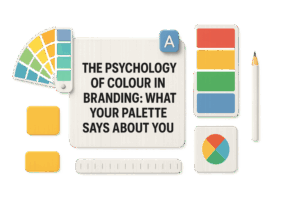
In the world of branding, colour is more than just a visual choice — it’s a psychological language that speaks directly to emotions and perceptions. The psychology of colour in branding: what your palette says about you is a fascinating subject that helps explain why certain brands feel trustworthy, exciting, or luxurious. Whether you’re designing a logo, choosing a website theme, or creating packaging, your colour palette can significantly influence how your audience perceives your brand. In this post, we’ll explore the science, strategy, and symbolism behind brand colours and what they truly communicate to your customers.
The Power of Psychology of Colour in Branding
Why Colour Choice Matters
Colour is one of the first things people notice about a brand — and it can shape first impressions in less than 90 seconds. Studies suggest that up to 90% of product judgments are based on colour alone. That’s why global brands spend millions perfecting their palettes.
When applied strategically, colours can:
- Trigger emotional responses
- Increase brand recognition by up to 80%
- Influence purchase decisions
- Differentiate a brand from competitors
As branding expert Paul Rand once said,
“Design is the silent ambassador of your brand.”
And colour is that ambassador’s voice.
Understanding the Psychology of Colour in Branding: What Your Palette Says About You
Every colour has its own psychological meaning. Let’s break down what each major hue communicates about your brand.
Red: Passion, Power, and Urgency
Red evokes strong emotions — energy, excitement, and urgency. It’s often used by brands that want to grab attention and stimulate appetite or action.
Examples: Coca-Cola, YouTube, and Netflix.
Best for: Food, entertainment, and retail brands.
Blue: Trust, Calm, and Reliability
Blue is the colour of dependability and professionalism. It’s frequently used by tech and financial brands because it builds a sense of trust and security.
Examples: IBM, Facebook, and PayPal.
Best for: Technology, finance, healthcare.
Green: Growth, Health, and Nature
Green symbolizes balance, freshness, and renewal. It connects deeply with eco-friendly, organic, and health-oriented brands.
Examples: Starbucks, Whole Foods, and Spotify.
Best for: Environment, wellness, and lifestyle sectors.
Yellow: Optimism, Warmth, and Creativity
Yellow is bright and uplifting — a colour that radiates happiness and creativity. However, when overused, it can feel overwhelming, so balance is key.
Examples: McDonald’s, IKEA, and Snapchat.
Best for: Youthful, energetic, and creative brands.
Purple: Luxury, Imagination, and Wisdom
Purple represents sophistication and creativity. It’s often chosen by brands that wish to convey luxury, quality, or innovation.
Examples: Cadbury, Hallmark, and FedEx.
Best for: Premium, beauty, and educational brands.
Black: Elegance, Strength, and Authority
Black is powerful and timeless. It’s associated with exclusivity, mystery, and professionalism — a favourite among luxury and fashion brands.
Examples: Chanel, Nike, and Apple.
Best for: High-end, tech, and lifestyle brands.
White: Simplicity, Purity, and Modernity
White brings clarity and space. It’s used by brands that want to project simplicity, openness, and a modern aesthetic.
Examples: Apple, Samsung, and The North Face.
Best for: Minimalist, clean, or tech-focused identities.
How to Choose the Right Colour Palette for Your Brand
- Understand Your Brand Personality
Start by defining your core values and audience. Is your brand fun and youthful or sophisticated and professional?
Use your brand’s tone and mission to guide your colour selection.
- Consider Your Audience’s Emotional Triggers
Different demographics respond to colours differently. For instance, younger audiences may prefer vibrant tones, while older or professional audiences may lean toward muted, trustworthy hues.
- Analyze Your Competitors
Study the colour trends in your industry — but don’t blend in. Find opportunities to stand out while maintaining relevance.
- Test and Refine
Before finalizing your palette, test your colours on multiple platforms — website, packaging, and ads — to see how they appear across media.
Colour Combinations That Communicate the Right Message
A single colour says a lot, but combinations tell a story. The harmony between your primary, secondary, and accent colours determines the emotional tone of your brand.
Here are some classic examples:
| Colour Scheme | Message | Brand Example |
| Red + Yellow | Energetic & Youthful | McDonald’s |
| Blue + White | Trustworthy & Clean | |
| Black + Gold | Luxury & Prestige | Versace |
| Green + Brown | Natural & Organic | Whole Foods |
Tip: Use the 60-30-10 rule —
- 60% primary colour
- 30% secondary colour
- 10% accent colour
This ensures a balanced and professional look across all brand assets.
Colour Trends in Modern Branding (2025 Outlook)
As we move into 2025, psychology of colour in branding continues to evolve. Current design trends reflect a blend of emotional authenticity and digital aesthetics.
Popular colour directions include:
- Soft Neutrals: Reflecting calm, simplicity, and eco-consciousness.
- Digital Blues & Purples: Evoking trust and innovation in tech-driven brands.
- Earthy Greens & Terracottas: Signifying sustainability and human connection.
Brands today aim not just to attract the eye but to connect with hearts — and your palette plays a vital role in that mission.
Conclusion
The psychology of colour in branding: what your palette says about you is a powerful reminder that every hue carries a message. The colours you choose define how people feel about your brand — even before they read your tagline or experience your product. Whether your brand identity leans toward the bold energy of red, the calm trust of blue, or the elegance of black, your palette tells your story without words.
Choose wisely, test thoughtfully, and let your colours speak with purpose. Remember, branding is not just about being seen — it’s about being remembered.